
Image trend: Letterbox
November 1, 2015
Color trends affect many areas of life — fashion, interiors and, yes, graphic design. It’s important to keep up with color directions to ensure that your marketing has the look and feel of being current.
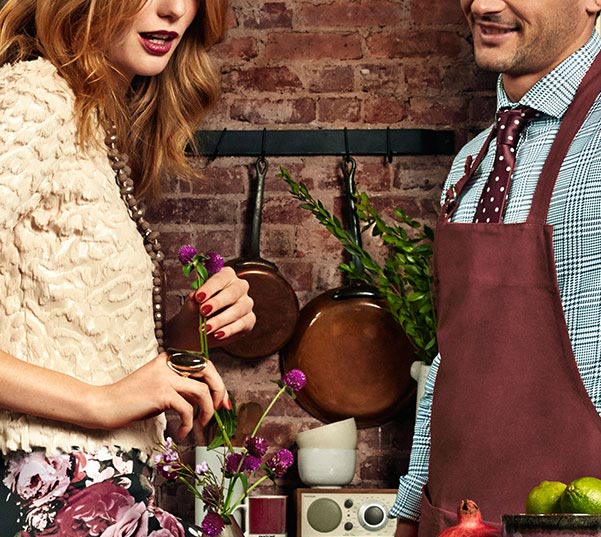
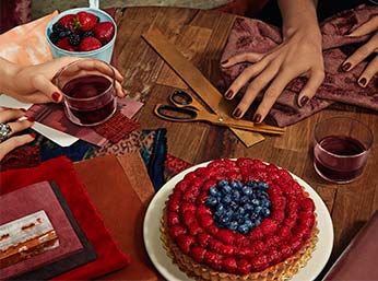
Marsala is ideal for use in graphic design and packaging. Eye-catching, but not overwhelming or bright, consumers are immediately drawn to the hue.
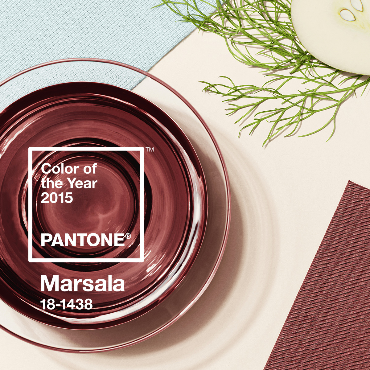
The Pantone Color Institute®, a leading authority on color directions, has named PANTONE® 18-1438 Marsala, a naturally robust and earthy wine red, 2015 Color of the Year.
“Marsala enriches our mind, body and soul, exuding confidence and stability,” said Leatrice Eiseman, executive director of the Pantone Color Institute. “Much like the fortified wine that gives Marsala its name, this tasteful hue embodies the satisfying richness of a fulfilling meal, while its grounding red-brown roots emanate a sophisticated, natural earthiness.”
Images from Pantone®
Marsala is ideal for use in graphic design and packaging. Eye-catching, but not overwhelming or bright, consumers are immediately drawn to the hue. As packaging becomes increasingly more artistic, Marsala will be a natural fit for periodicals, calendars and stationery.
November 1, 2015

October 1, 2015

September 1, 2015